
I’m Alex Zhurabin, a senior art director and branding lead working across branding, advertising, campaign systems, UX/UI and AI-driven creative production.
This page is a curated selection of portfolio highlights — key projects that show my ability to build visual systems, develop creative concepts and translate ideas into real-world brand experiences.
 HOT Consumer ClubA rebranding and long-term communication system for a consumer club |  AMERICAN LASERBrand comeback campaign and visual system for a national aesthetic clinic chain. |  HAYOTZER WINEA premium packaging label design projects and advertising |
|---|---|---|
 BIG APPLE3A branding and packaging system for a pizza chain inspired by New York culture |  JIVAGOProduct-series logo, packaging and visual design for a fragrance line. |  AMANAI Character-led brand film for the Israeli Myeloma Association. |
 LEMETAELA sensitive brand refresh and umbrella system for one of Israel’s most familiar travel brands. |  PAZGAZIMA character-based creative platform for Pazgas, built around a family |  PAMAA full rebranding project for a long-standing car financing company. |
 Character WorldsClay-style character development, stop-motion thinking and AI visual storytelling. | 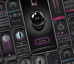 OMEGA HELMETOmega is a speculative concept for a smart protective helmet and mobile app. |  ABA DONEUX/UI and branding concept for a family task-management app. |
 NETANYA ACADEMIC COLLEGEEarly AI-based campaign system for academic open day communication. |
HOT Consumer Club
Rebranding, Brand System & Video Campaign Platform

Background
HOT Consumer Club is a benefits club for engineers, practical engineers, technicians and people from the technology world in Israel. It is not a general consumer club for the wider public, but a closed club for a specific professional audience.
Still, many potential members did not immediately understand what the brand was, who it was for, or why they should join.
The Problem
The brand had several key problems. First, the name HOT created confusion with the well-known telecom company. Since the name could not be changed, the brand had to explain itself much more clearly. Second, the visual language felt outdated, generic and not connected enough to the world of technology. It did not create a strong enough feeling of a club for people from engineering, technology and hi-tech environments.
Another problem was that many people knew the club through their workplace or professional association, but the brand itself was not clear, independent or attractive enough.
The Challenge
The main challenge was not only to update the design, but to create a clear identity: to make people quickly understand that HOT is a club for technology people.
The project had to overcome the confusion around the name, update the visual language, make the brand feel more current and build a system that could work continuously across digital, social, app, offers, videos, presentations and ongoing communication.


Strategic Direction
A new communication platform was defined:
HOT — The Choice of Technology People.
This idea helped focus the brand: not just another consumer club, but a club speaking to a very specific audience — people from the world of technology.
Creative Development
My role was to translate the strategic idea into a living visual and communication system.
I worked on the updated logo, color system, typography, icons, graphic patterns, digital templates, category system and visual logic for offers, cards, app communication and ongoing brand materials.
The goal was not only to create a cleaner brand book, but to build a system the client could use every day.
The Solution
The result was a complete brand system that made HOT Consumer Club clearer, more modern and more flexible.The new system allowed the brand to speak to its audience more precisely, look closer to the world of technology, and still remain friendly, accessible and commercial.

Video Campaign Platform
The project did not end with a brand book. It continued into a campaign and video platform with a brand presenter - Dani Kamshevitz.
The campaign included a main film, short social videos and seasonal one-liners built around one simple structure: a quick joke, a clear member benefit and the brand closing line. This turned the brand from a static identity into an ongoing communication platform that could work throughout the year across offers, holidays, social content and digital campaigns.
Main
One-liners
Video Campaign Platform
The project did not end with a brand book. It continued into a campaign and video platform with a brand presenter — Dani Kamshovitz.
The campaign included a main film, short social videos and seasonal one-liners built around one simple structure: a quick joke, a clear member benefit and the brand closing line.
This turned the brand from a static identity into an ongoing communication platform that could work throughout the year across offers, holidays, social content and digital campaigns.
What the Client Received
The client received a complete brand and communication system:
updated logo, brand book, color system, typography, icons, graphic patterns, category system, digital and social templates, app and offer communication, presentation materials, main campaign film, short social videos, seasonal one-liners,
and an ongoing video platform with a brand presenter.
My Role
My role was to lead the creative and visual side of the project: from the brand system and client presentations to the design team, campaign development, presenter format, filming, post-production and adaptation of materials across channels.
Result
By the end of the year, the brand reached 120% of its planned annual targets across activity, sales and new member acquisition.
Portfolio Value
For me, this case shows how a rebrand can become much more than a new visual identity. It became a clear brand system, a communication platform and a long-term content engine for a very specific professional audience.
Hayotzer Wine
Packaging, Label Design & Premium Print Finishes


Context
A focused packaging project centered on product presence, materiality, typography, artwork and premium print execution.
Challenge
Wine is a crowded shelf category. The label had to create attention, emotion and perceived value within seconds.
Solution
A series of wine labels and packaging applications was created using expressive artwork, strong contrasts, dark surfaces, gold details, tactile materials and special print finishes.
My Role
I developed the visual and packaging direction, connecting artwork, typography, material decisions and print finishes into a premium product identity.
Value
This case adds craft, packaging sensitivity and physical product thinking to the portfo
Pama
Full Rebranding, Brand Book & Visual System


Context
Pama is a car financing company with 30 years of history, recognition and trust.
Challenge
The brand felt outdated and needed a clearer, more professional visual language without losing the trust it had already built.
Solution
A cleaner and more flexible identity was developed, including logo system, typography, colors, icons, layouts, advertising templates, digital assets and usage guidelines.
Process
The work included logo exploration, refinement, color development, 3D checks,
positive / negative versions and real application tests.
My Role
I led the process directly with the client, from visual direction and logo development to the full brand book and rollout logic.
Value
A mature brand was updated carefully, becoming more current, clear and practical across communication channels.


Lametayel
Sensitive Brand Refresh & Umbrella System


Context
Lametayel is one of Israel’s most recognizable travel brands, covering stores, website, travel content, equipment, insurance, flights, SIM/eSIM, lectures and travel services.
Challenge
The brand was familiar and loved, but the visual system was overloaded and not flexible enough for a multi-category travel ecosystem.
Solution
A sensitive refresh was created: cleaner logo treatment, updated visual language and a wider umbrella system for retail, digital, exhibitions, promotions and category communication.
My Role
I led the visual refresh, preserving brand recognition while making the system more modern, flexible and easier to use.
Value
A well-known local brand was updated without losing its memory, character or emotional connection with travelers.


Jivago
Product-Series Logos, Packaging & Digital Design

Context
Jivago is a fragrance and beauty brand sold across different markets and represented in Israel through Lilith, including Super-Pharm and Duty Free.
Challenge
Each fragrance series needed its own identity while still belonging to the wider Jivago brand world.SolutionFor each line, I developed logo, typography, bottle graphics, packaging, color palette and finishing details. Over time, this created a broad product-family system across series such as Golden Royal, Status, Golden Elements, Lyrica and others.
My Role
designed product-series logos, packaging, bottle graphics, labels, boxes, sales materials, website assets and digital materials.
Value
This case shows long-term product-brand work: many identities inside one fragrance brand, each distinct but commercially connected.





American Laser
Brand Comeback, Campaign & Nationwide Rollout

Context
American Laser is a highly recognized Israeli brand in laser hair removal and aesthetics, returning after a serious business crisis.
Challenge
The brand had strong awareness, but also distrust and negative memories. The comeback had to be bold, visible and careful at the same time.
Creative Direction
Campaign line: MAKE AMERICAN LASER GREAT AGAIN
Creative credit: senior copywriter Tomer Abramovich.
Solution
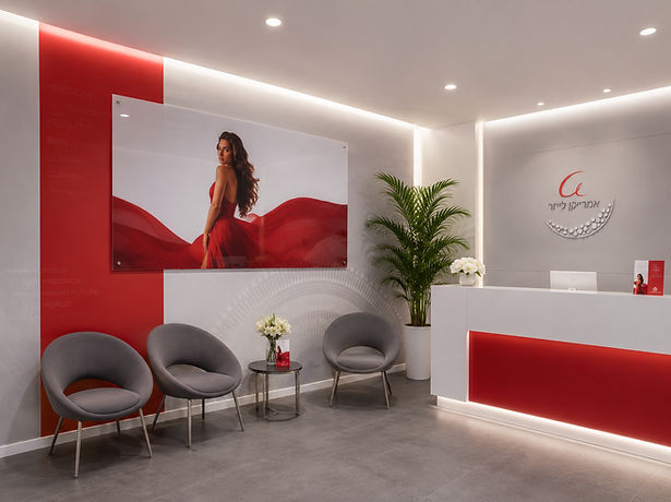
A campaign system was developed across digital, social, outdoor, TV, landing pages, branch communication and sales materials, with Noa Kirel as the face of the brand.

.png)
.png)
.png)


Rollout
The project included visual updates for 15 branches nationwide: windows, glass applications, signage, wallpapers, perspex, print materials and production supervision.
My Role
I led the visual refresh, campaign system, channel adaptations and branch rollout design.
Value
A sensitive comeback became a confident and visible relaunch, reconnecting the brand with relevance and commercial energy.
.png)
BIG APPLE PIZZA
Branding, Packaging, Menu & Visual System for a Pizza Chain


Context
Big Apple Pizza is a pizza chain built around a real personal story: a founder who brought his love and memories of New York back to Israel, and a son who continued that dream.
Challenge
The challenge was not to create another generic “New York pizza” brand, but to build something urban, warm, memorable and personal.
Creative Direction
The visual language combines nostalgic black-and-white New York imagery, bold red accents, strong typography and a simple, recognizable brand system.
What I Did
I developed the visual language and brand world across logo, menu design, packaging, pizza boxes, signage, interior elements, photography direction, advertising materials and real brand touchpoints.
Value
The result was a complete brand world: personal, urban, commercial and alive — a system that works across restaurants, packaging, digital, advertising and physical experience.
Why It’s Here
This case shows how a personal story can become a full commercial identity, not just a visual style.


ABA DONE
Branding & UX Concept for a Parenting-Life App

Aba Done is a conceptual branding and UX-UI project
based on a simple Israeli insight:
Parents today live fully adult lives — kids, work, money, schedules and responsibilities — but inside, many still refuse to become “old adults.”
The idea grew from the self-ironic phrase Aba Pagum: not a bad parent, but a real one. Someone who forgets, improvises, arrives late, makes mistakes, laughs about it — and still shows up.
Most parenting apps feel too clean, correct and managerial. Aba Done offers a warmer alternative: a family-management experience that helps parents organize tasks, kids, shopping, meetings and home logistics with humor, empathy and a human tone.
Done means the task is closed.
Aba Pagum means nobody is perfect — but somehow, life gets done.
I developed the naming, concept, tone of voice, visual system, UX logic, mobile flow and presentation structure.
This case shows how a cultural insight can become a brand, a product experience and a potential content platform.
PAZGAZ
Character Platform & Social Content System for Pazgas


Context
Pazgas operates in a category where it is hard to create emotional interest. Gas, cylinders, service and home energy are functional topics people rarely think about every day.
Challenge
Most brands in the category speak about the same things: service, price and reliability. The challenge was to find a warmer, more memorable and more human way to speak to families.
Creative Idea
Pazgazonim is fully my idea. It is a family of characters inspired by the shape of a gas cylinder.
Instead of speaking only about the product, the brand starts speaking through home, family, habits, humor and everyday situations.
Creative Direction
Pazgazonim is not just a set of cute characters. It is a character platform that can live across social, TikTok, reels, stickers, seasonal posts, short videos, outdoor and ongoing brand communication.
Development
The characters allow the brand to tell stories about gas through real life: cooking, showers, kids, parents, holidays, winter, summer, small family conflicts and funny home moments.
Current Status
The project is currently in development. It has been presented to the client as a creative direction and character platform, but has not yet launched publicly.
Value
The project creates emotional differentiation for a low-interest category. It makes the brand friendlier, more memorable and more flexible for continuous content.
Why It’s Here
This case shows my USP as a creative thinker: the ability to turn a technical, low-emotion category into a living emotional world with characters, humor and long-term content potential.


NETANYA ACADEMIC COLLEGE
Early AI-Based Campaign System, Landing Pages & Open Day Communication
A large-scale campaign system for Netanya College, created few years
ago, at a very early stage of using AI in advertising and design.
The project started with a UX/UI redesign of complex landing pages for different academic programs. It later expanded into a full campaign system: around 18 landing pages, social assets, outdoor signage, open day materials and printed brochures for different study fields.
The idea was to use AI-generated illustration not as a one-off visual experiment, but as part of a real advertising system with many formats, messages and applications.
My role included developing the visual direction, UX logic, landing page structure, AI-based visual language, campaign materials and adaptations across digital, print and outdoor.
This case shows an early attempt to integrate AI into a complete production workflow — turning a new and uncertain tool into a working campaign system.
AMEN
The Israeli Association of Myeloma Patients
AI Character-Led Brand Film
A short brand film for AMEN, the Israeli Myeloma Association, created to present the organization’s activity in a more emotional and accessible way.
The challenge was to connect many real materials from different years — footage, events, patient support activities, archive content and organizational work — without turning the film into a dry or depressing report.
The idea was to tell the story through Tikva, an illustrated character who guides the viewer through a corridor of doors. Each door reveals another part of the organization’s work: support, information, community, media and help for patients and families.
My role included developing the creative concept, the character direction, the corridor-and-doors metaphor, the visual storytelling structure and the AI-assisted visual development.
The result is a hybrid film that combines real organizational materials with an emotional illustrated journey — turning a complex medical subject into a more human story about support, hope and connection.

Omega Helmet
Final UX/UI project at Netcraft Academy, created during the Covid period

Omega is a speculative concept for a smart protective helmet and mobile app, designed for people at high medical risk. The helmet helps users stay protected, mobile and active while remaining isolated from the external environment.
The project combines UX/UI, product imagination, scenario thinking and a playful future vision of wearable technology
CHARACTER WORLDS
Clay Characters, Stop-Motion Thinking & AI Visual Storytelling
Context
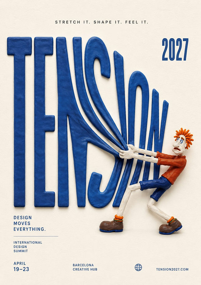
Clay character development, character design and stop-motion thinking became an additional creative direction in my work, especially in the AI era.
Why It Matters
Today, many people can generate a beautiful image. But building a character with personality, emotion, movement, behavior and a world around it is not just a skill — it is an additional USP.


Creative Direction
I treat a character not as an illustration, but as a small actor: it needs to move, react, make mistakes, express emotion, create humor and live across different formats.
Development
This direction connects art direction, character development, stop-motion thinking, short-form content, visual storytelling and AI-based production.
PAZGAS WATER HEATER CAMPAIGN
Sales Campaign Based on My Human Insight
Context
The campaign promoted a Pazgas gas water heater. Formally, it is a technical product: it provides hot water quickly and continuously.
But the communication could not rely only on function, because “hot water” alone is too rational and does not create a strong emotion.
My Insight
The core idea was mine. It came from a very familiar family situation: small wars at home around hot water.
Who showers first?
Who gets none?
Why is the boiler empty again?
Who left everyone else without hot water?
The insight was that we were not really talking about hot water. We were talking about peace at home — ending the daily family tension around the shower.
Creative Idea
End the bathroom wars.
The product became more than a water heater. It became a solution that brings calm back home: always hot water, fewer arguments, less irritation and less morning and evening chaos.
Development
The entire campaign was built around this situation. Instead of presenting the product as a dry technical device, the campaign translated it into a human conflict every family understands immediately.
The idea later continued into different executions, tests and campaign materials because the insight was clear, relatable and sales-driven.
Result
I cannot honestly name exact lead or sales numbers, but there was a strong business signal: the campaign and aggressive marketing had to be paused due to stock limitations. Demand became stronger than the available product supply.
Value
This case shows the ability to find a human and sales-driven insight inside a technical product. We were not selling only hot water — we were selling peace at home.
Why It’s Here
It proves that I can turn a functional product into a clear emotional promise that people immediately understand.